- $USD
- English (United States)
- Hire an Expert
- Get Support




Sold Exclusively on

Composite Products
Let Your Customers Create their Product with WooCommerce Composite Products Plugin!
Composite Products Builder for WooCommerce works for any store selling custom PC builds, configured furniture, made-to-order product sets, or any product that requires customers to choose multiple parts before purchasing. Customers move through each component step by step, see a live running total, and...
Details & Compatibility
Version
2.0.0
Last Update
August 7, 2026
Compatibility
WooCommerce version 2.6.0 or higher | Wordpress version 4.6 or higher
Support
6 months support from extendons
Whats Include
- Quality checked by Envato
- Future updates
$0.00
Buy From CodecanyonCustomize this Plugin
CustomizeMain Feature
Composite Products Builder for WooCommerce gives you complete control over how customers configure and purchase complex products. Create composite products with unlimited components, choose from seven builder layouts, and set individual pricing using five adjustment types. With a live summary panel, review step, save and share options, and branded PDF download, the plugin covers everything you need to deliver a structured and confident buying experience for considered purchases.
- Unlimited priced components
- Seven customizable builder layouts
- Grid or dropdown selector
- Five pricing adjustment types
- Minimum maximum quantity controls
- Live build total
- Review before checkout
- Save share export builds

The option to add store items as components to make a whole product

The option to set a base price for all the components separately

Use three different layouts to display the components

Limit the quantity of a component that a customer can add
Mark the components mandatory and offer discounts
Charge per-item shipping fee or charge cumulative.
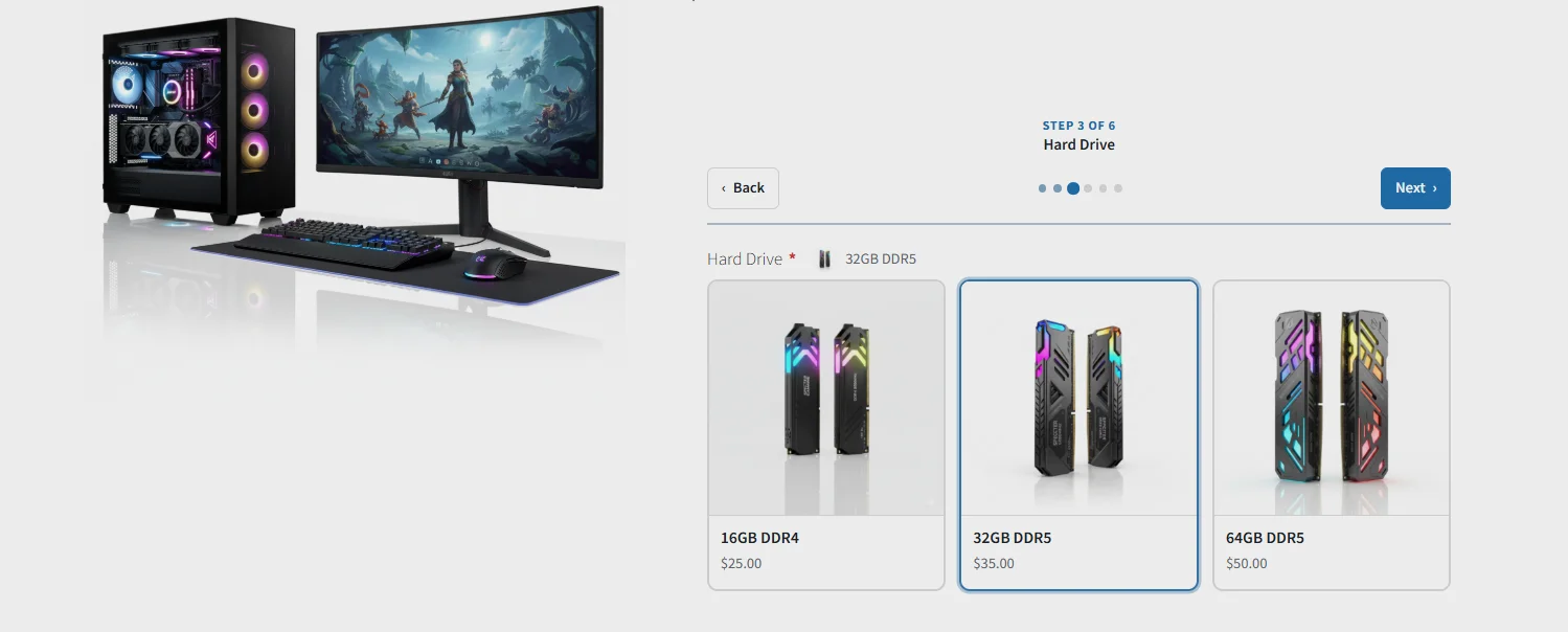
Allow Customers to Compose Products on Their Own
Set the product type to Composite Product and add as many components as needed from the Components tab. Each component acts as a configurable slot with its own name, description, placeholder image, and product scope. Customers move through each component step by step on the product page and choose from the options defined for each slot.
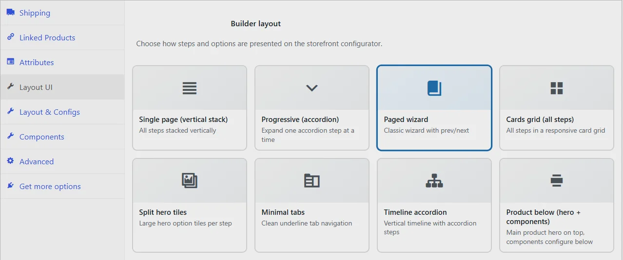
7 Builder Layouts to Display Components
The Layout UI tab gives you seven ways to present the composite builder on the product page. Choose from Single Page vertical stack, Progressive accordion, Paged wizard, Cards grid, Split hero tiles, Minimal tabs, Timeline accordion, and Product below with hero and components. Each layout changes how steps and options are presented on the storefront so you can match the builder experience to your product type and store design. A custom accent color can also be set to align the builder with your brand.
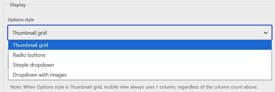
Display Components as Thumbnail Grid or Dropdown
Each component can be displayed as a thumbnail grid showing product options as image cards, or as a dropdown select field. For the thumbnail grid, you can configure the number of columns displayed, with mobile view switching to a single column automatically. Customer filters can also be enabled within each component so shoppers can narrow down available options before making a selection.
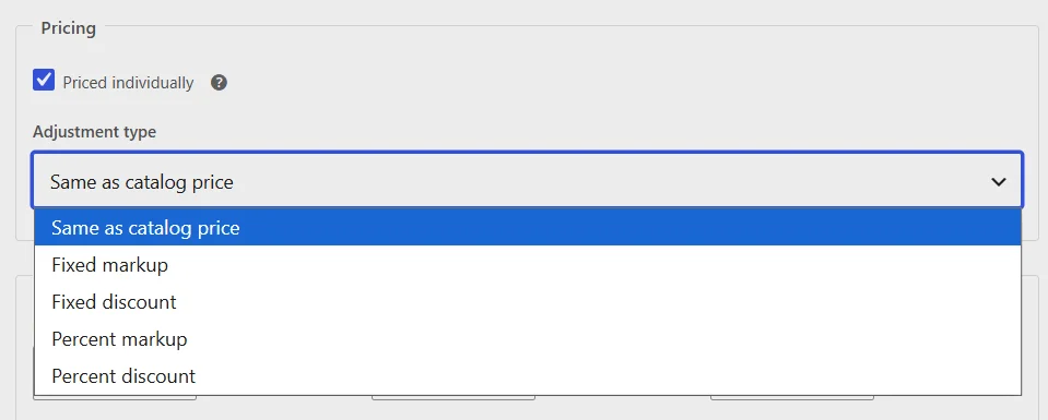
Per-Component Pricing with Adjustment Types
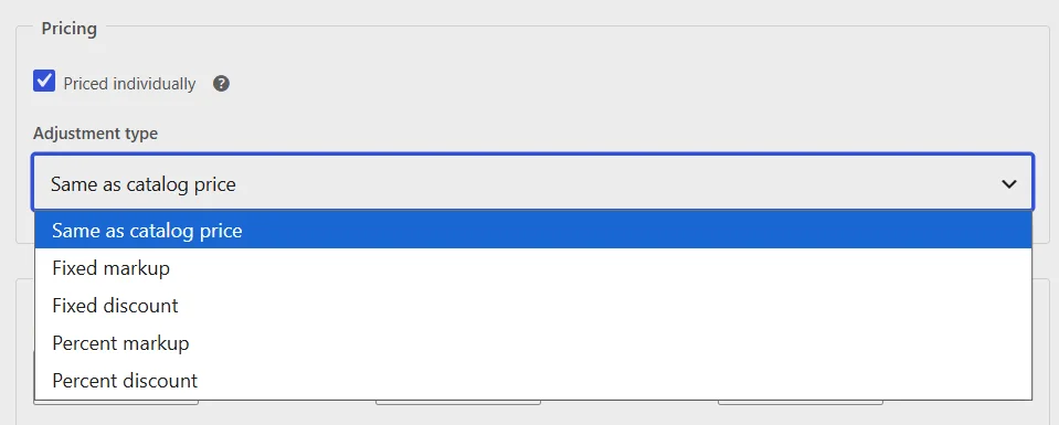
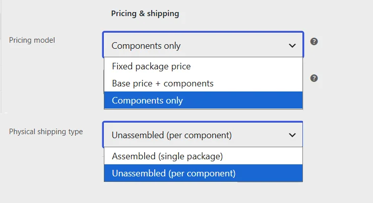
Each component can be priced individually using one of five adjustment types: same as catalog price, fixed markup, fixed discount, percent markup, or percent discount. The pricing model at the product level can be set to components only or base price plus components, where a fixed base price is added on top of the selected component prices.
Quantity Controls Per Component and Container
Set a minimum, maximum, and step value at the component level to control how many units of that component a customer can select. At the container level, set the minimum and maximum number of composite units a customer can order along with a quantity step increment to keep the overall order within defined limits.
Flexible Pricing and Shipping Configuration
Set the shipping type to Unassembled to charge shipping per component separately, or Assembled to apply a single shipping fee to the product as a whole. This lets you align shipping costs with how your products are actually packed and dispatched.
Live Build Summary Panel
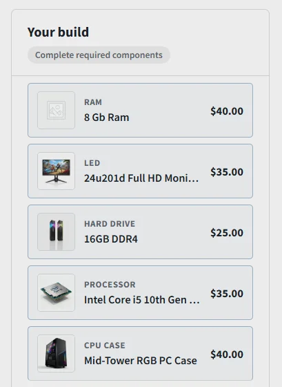
The summary panel gives customers a live view of their build as they make selections. It updates in real time with each chosen component's name, image, and price alongside a running total, so customers always know exactly what they are building and what it will cost.
Review Step Before Adding to Cart
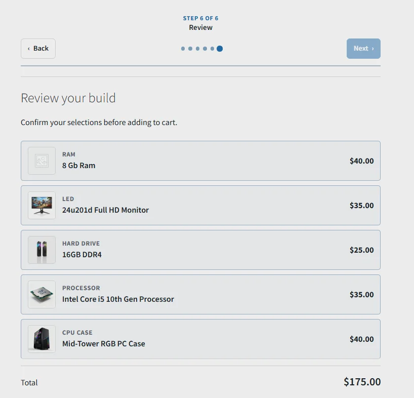
Enable the review step within the summary panel to show customers a full confirmation of every selected component before the product is added to the cart. This reduces errors and gives customers confidence that their build is exactly what they intended.
Save Builds for Later
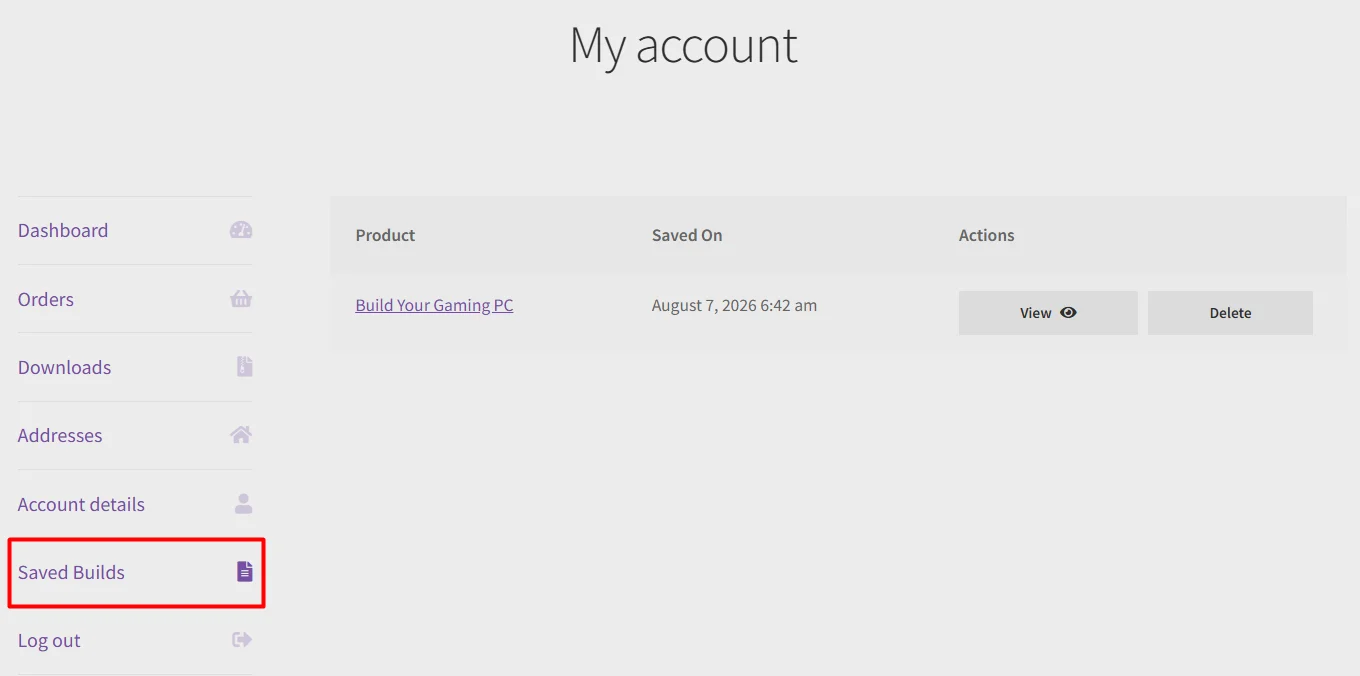
Customers can save their current build using the Save Build button and return to it from their My Account page under a configurable tab label. Set the maximum number of saved builds per customer. Guest users have their builds retained in a browser cookie for a configurable number of days so they never lose their configuration between sessions.
Share Build Configuration
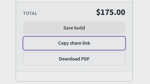
A shareable link can be copied directly from the product page, loading the exact same build configuration for anyone who opens it. This is useful for customers who want input from someone else before purchasing, or for B2B scenarios where a configuration needs approval before an order is placed.
Download Build as PDF
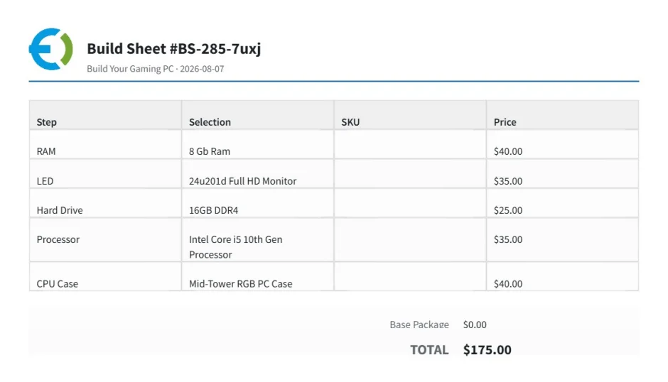
Customers can download their build as a branded PDF showing all selected components and the total price. The PDF includes a custom logo uploaded from the plugin settings and can be generated in a configurable paper size and orientation, making it easy to review or share the configuration offline.
Review & Rating
Frequently Asked Questions
-
 30-day money back guarantee
-
 Dedicated Support Team
-
 Safe & Secure Free Update
-
 Safe Customized Solutions