- $USD
- English (United States)
- Hire an Expert
- Get Support



- Blog
- Dropdown vs Variation Swatches for WooCommerce: Which Selector Converts Better?
Dropdown vs Variation Swatches for WooCommerce: Which Selector Converts Better?
August 4, 2026
posted in WooCommerce by
Conversion data: what A/B tests say about dropdown vs radio
When you strip away the opinions and design theory, the data consistently points in one direction: visible options beat hidden ones. Testing across different industries shows the same pattern, whether the choice is a product size, a color, or a service tier.
MarketingSherpa's analysis of similar tests found that the radio button field out performed the dropdown field by 15% in order rate. When customers have to pick one option from several, showing them all upfront reduces friction. They can see the full range of choices at a glance and make a decision without an extra click.
Why do radio buttons and swatches perform better? It comes down to cognitive load. A dropdown asks the customer to remember what they saw in the closed menu while comparing it against other closed menus. Radio buttons and swatches present the full decision space immediately. The customer sees all options, compares them, and selects. That reduction in mental effort translates directly into faster decisions and fewer abandoned choices.
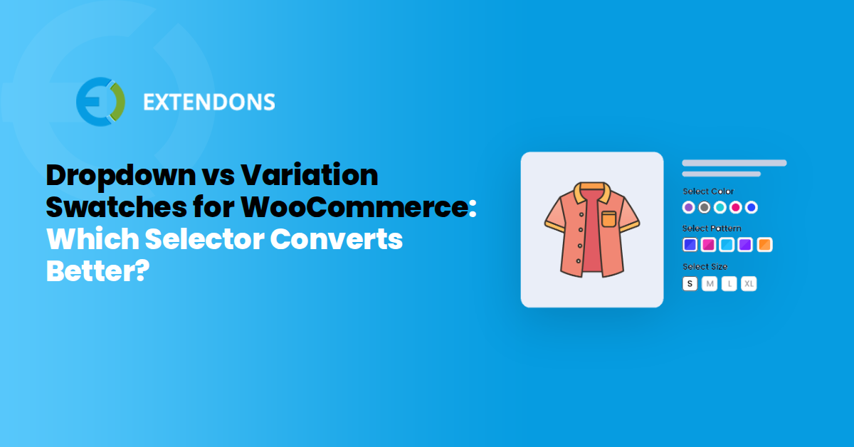
For WooCommerce stores, this is where the shift to a visible selector becomes commercially relevant. Replacing a dropdown with visible swatches isn't just a visual refresh; it's applying the same UX principle that has produced consistent conversion gains in controlled tests. The products remain identical, the price stays the same, and the only change is how the customer interacts with the selection. That's the kind of optimization that pays for itself. The top pick for this is Variation Swatches for WooCommerce which replaces the default dropdown with buttons, text labels, images, or colors for a better shopping experience.
When dropdowns still make sense (and radio buttons don't)
For all the conversion data favoring radio buttons, dropdowns are not a UX sin. They solve real problems that radio buttons create when your product catalog gets complex. The key is knowing when the trade-off works in your favor.
The most obvious case is size. A product with 25 color variations, like a paint brand selling finish options or a phone case store with dozens of shades, turns a radio group into a scrolling nightmare. Nielsen Norman Group has long advised against radio buttons when the option count grows, because users have to scan a long vertical list and compare items that sit far apart. A dropdown collapses that list into one compact field, and the user can open it, scan, and select in a few seconds. The moment you hit roughly 15 or more options, a dropdown often converts better than a radio group simply because it keeps the page short.
Space-constrained themes are another genuine scenario. Product pages with a tight sidebar layout, or themes where the variation area sits below the fold, punish tall radio groups. A dropdown takes up a single line and leaves room for the add-to-cart button and trust badges. On mobile, this matters even more. Screen real estate is precious, and a long radio list forces excessive scrolling that can disorient shoppers mid-decision. Some mobile UX research suggests that for complex service configurators, the interaction time and completion drop compared to visible radio options cuts both ways: on very small screens, a collapsed dropdown can feel less overwhelming than a wall of buttons.
There is also a behavioral angle. When customers are choosing a product attribute they consider low-stakes, like a size label or a minor feature toggle, a dropdown reads as a casual selection. Radio buttons, by contrast, signal a more deliberate choice. That visibility is great for conversion when the option matters, but it can create friction when shoppers just want to move on. For stores selling configurable services or add-ons where the choice is minor, the dropdown's lower visual weight can actually speed up the purchase.
Finally, consider backward compatibility. Shoppers who have used ecommerce for a decade expect dropdowns for certain attributes. They know the interaction pattern, they know how to use it, and they don't need to learn anything new. That familiarity has value, especially for an older demographic or a B2B audience that prioritizes speed over polish. If your analytics show that a specific variation attribute rarely causes confusion and generates few support tickets, leaving it as a dropdown is a defensible, data-driven choice.
How to switch from dropdown to radio buttons in WooCommerce?
Switching your WooCommerce product variations from dropdowns to swatches is a straightforward process, but the right approach depends on your comfort level with code. You have two main paths: install a dedicated plugin or add a custom function to your theme. Both work, but they serve different audiences.
The plugin route is the fastest and safest option. If you're looking for a polished result that handles edge cases automatically, a plugin like WooCommerce product variations swatches takes care of everything without touching a single line of code. It replaces the default dropdown on your product pages with buttons, text labels, images, or color swatches, giving customers a clearer view of their choices before they click. With product updates and improvements, customer support, and a 30-day money-back guarantee included, it offers real value without requiring an upfront investment.
Here is the step-by-step process for the plugin approach:
- Install the plugin. Go to Plugins > Add New in your WordPress admin, search for "Variation Swatches as Radio Buttons," and click Install Now. After installation, activate the plugin.
- Configure the display type. Navigate to WooCommerce > Settings > Products and look for the plugin's settings tab. You can choose how each attribute appears on the front end, whether that's color swatches, image swatches, text labels, or standard radio button circles.
- Set global or per-product options. Most swatch plugins let you apply settings globally across your store. You can also override the display for individual products by editing the product in the WooCommerce product editor and selecting a custom swatch type there.
- Preview and test. Open a product page on your storefront and test each variation combination. Make sure the selected state is visually distinct and that the Add to Cart button behaves correctly.
- Check mobile responsiveness. Swatches need to remain tappable on smaller screens. Test on a phone or use the browser's responsive mode to confirm the swatch buttons are large enough to tap without accidental clicks.
If you prefer a code-based approach, you can add a small snippet to your child theme's functions.php file. This method gives you full control but requires more testing, especially after WooCommerce core updates. The basic idea involves unhooking the default variation selector output and replacing it with custom markup that renders radio inputs instead. A common starting point is filtering the woocommerce_dropdown_variation_attribute_options_html filter to generate your own HTML. However, be aware that this gets complex quickly when you need to handle images, tooltips, and out-of-stock states correctly.
For most store owners, the plugin approach is the better call. It keeps your theme lightweight, stays compatible with WooCommerce updates, and gives you a support channel if something breaks. The code approach is a reasonable path for developers who want absolute control and are comfortable maintaining their own solution over time.
One thing to keep in mind regardless of the method you choose: after switching, always check your product pages for attribute combinations that are out of stock. WooCommerce handles stock status differently depending on how you've configured the plugin, and you want to ensure unavailable options are clearly greyed out or hidden, so customers don't click Add to Cart on an impossible combination.
Variation Swatches: The Visual Upgrade Over Plain Selectors
Radio buttons solve the visibility problem, but they still ask customers to read rather than see. A label that says "Navy" or "Charcoal Grey" still leaves the shopper guessing what the product actually looks like. Swatches close that gap by showing the real color, image, or style right on the page, so the customer confirms a choice instead of interpreting one.
They keep everything that makes radio buttons work, full visibility, one click to select, no hidden menu, but add a visual layer that plain circles or text can't match. A row of true-to-product color swatches, finish thumbnails, or clearly labeled size buttons lets shoppers compare options the way they naturally would in a physical store. This matters most for categories where appearance drives the decision: apparel, furniture, personalized items, or any product where color and finish vary.
- Color swatches suit products where the shade itself is the deciding factor, like clothing, paint, or upholstery.
- Image swatches work best when variations look genuinely different, such as furniture finishes, sneaker colorways, or case designs.
- Text label buttons make sizing faster and clearer than a dropdown, lowering the odds of a wrong selection.
Quick Verdict
- Go with WooCommerce variation swatches plugin if your products have a handful of visible variations and you sell apparel, decor, or customizable goods where appearance matters.
- Stick with a dropdown if your catalog has a long list of options per attribute, your layout is tight on space, or your traffic leans heavily mobile and the native picker already works well.
- When unsure, test both on your top product page for a couple of weeks and let your own store's data settle it.
Conclusion
Choosing between a dropdown, radio buttons, or swatches comes down to how many options you're showing and how much those options matter to the buying decision. Dropdowns still make sense for long lists or space-constrained layouts. But for most WooCommerce stores selling a handful of visible variations, showing the choices upfront removes friction and helps customers decide faster.
If your products lean on appearance, color, finish, or style, swatches are worth the switch. They give shoppers a clearer picture before they click, which means fewer second-guesses and fewer abandoned carts. The setup takes a few minutes with the right plugin, and it's a change you can test on a single product page before rolling it out across your store.
Frequently Asked Questions
When should I NOT use radio buttons?+
Avoid them when you have a very long list of options, typically 15 or more. A dropdown keeps the page compact and prevents a wall of buttons from overwhelming shoppers. Complex configurators with many attributes may also work better with dropdowns, keeping in mind the mobile UX exception.
Do swatches work better than plain radio buttons?+
Swatches add a visual layer that text alone cannot provide. If customers need to see color, texture, or pattern, image or color swatches help them confirm their choice faster. For simple text choices like size, both work well.
How do I switch from dropdowns to swatches in WooCommerce?+
The easiest route is to install Variation Swatches as Radio Buttons by Extendons. It replaces the default dropdown with your choice of buttons, text labels, images, or colors without touching code. Alternatively, you can add custom code to your theme's functions.php file, but this requires more maintenance.
Will switching to swatches slow down my site?+
A well-built swatch plugin adds minimal overhead. The main consideration is image optimization if you use image swatches. Keep thumbnails compressed and lazy-loaded where possible.
Do swatches work on mobile?+
Yes. Swatch buttons give customers larger touch targets than dropdown arrows, which can reduce accidental taps. Test on a real phone to ensure the buttons are easy to tap without zooming.
Share Article
-
 30-day money back guarantee
-
 Dedicated Support Team
-
 Safe & Secure Free Update
-
 Safe Customized Solutions